Install Android Launcher appsgeyser
| Facebook | Fan Pages | Youtube | Twitter
Info RoelCK :
Blog ini doFollow Ndi'
Top
Download The roel cipta kreasindo Free Android App
Top
QRCode
Download The roel cipta kreasindo Free Android App

Total Kunjungan

Translate

Tutorial Membuat Efek Nashville Instagram

Jumat, 30 November 2012

Penggunaan aplikasi smartphone yang bernama Instagram saat ini sedang populer sekali di kalangan pengguna smartphone Android dan Iphone. Lalu bagaimana jika Anda ingin mencoba efek-efek foto yang disediakan oleh Instagram ini namun Anda tidak memiliki device yang saya sebutkan diatas?? Tidak usah khawatir karena saya disini akan mencoba untuk membuat tutorial Photoshop dari salah satu efek yang ada di Instagram, mari langsung ikuti saja Tutorial Efek Nashvillenya.

1. Buka Photoshop Anda, kemudian buka gambar yang ingin Anda edit.

foto model jepang

Foto: Model Jepang
, bisa dicari di Google Search

2. Lakukan duplikat layer dengan menekan
CTRL+J

3. Kemudian pilih menu
Image > Adjustment > Curves kemudian atur channel green dan blue.
Setting Efek Nashville


4. Tekan
CTRL+L atau pilih menu Image > Adjustment > Levels dengan pengaturan seperti di bawah ini.
Setting Efek Nashville


5. Kemudian pilih menu
Image > Adjustment > Brightness > Contrast.
Setting Efek Nashville


5. Sejauh ini gambar yang dihasilkan adalah sebagai berikut.

Setting Efek Nashville


7. Tekan
CTRL+M untuk menggunakan curves lagi, channel yang diedit yaitu green dan blue.
Setting Efek Nashville

Lalu
Setting Efek Nashville


8. Pilih menu
Image > Adjustment > Brightness / Contrast aturlah seperti di bawah ini.
Setting Efek Nashville


9. Tekan
CTRL+M kali ini channel yang kita edit adalah channel Red dan Blue.
Setting Efek Nashville

Lalu,
Setting Efek Nashville


10. Buat layer baru dengan menekan
CTRL+Shift+N kemudian fill dengan warna coklat muda (#f7d9ad).
Setting Efek Nashville


11. Langkah terakhir ubah blend mode layer 2 ini menjadi
Multiply.
Setting Efek Nashville

Hasil akhir
Efek Nashville Instagram

Efek Nashville
pada foto Model Jepang
Pada gambar lain:
Setting Efek Nashville

terima kasih. Semoga bermanfaat
- Reviewer: Unknown - ItemReviewed: Tutorial Membuat Efek Nashville Instagram

12 Foto Ter-KEREN via Instagram

Kamis, 22 November 2012

Mejelang Worldwide Photowalk & Instameet di Bali pada tanggal 31 Maret-2 April nanti, Anda pastinya telah bersiap membuat foto-foto keren di setiap titik yang Anda kunjungi di Bali. Untuk itu tak ada salahnya Anda menjadikan 12 foto Instagram ini sebagai inspirasi sebelum berangkat bertemu para penggila Instagram di Bali akhir Maret nanti.

12 Foto ini dipilih oleh situs Mashable sebagai 
“The Best Instagram Photos Ever Taken”. Anda bisa mencermati tiap detailnya untuk menemukan point penting sehingga semua foto tersebut layak menyandang predikat foto Instagram terbaik. Juga, silakan membandingkannya dengan foto-foto yang tak kalah keren lainnya di InstaGo :)

1. 
Maura Grace (@folkfibers)
Maura hobi travelling ke seluruh Amerika dengan berkendara VW van miliknya. Di sepanjang perjalanan ia abadikan hal-hal menarik melalui foto yang seringkali mampu bercerita lebih dari apa yang bisa ditulis melalui kata-kata.


2. 
Simon (@stmng)
Komposisi image hasil jepretan Simon ini sungguh luar biasa. Penggunaan blur tool untuk menciptakan depth of field dan warm tones atas proses black & white menghasilkan suasana foto yang begitu cantik.


3. 
Tyson Wheatley (@twheat)
Ya, terkadang Anda perlu fokus pada beberapa bagian saja dibanding harus fokus pada keseluruhan subyek. Bayangan keabuan, bercak putih dan kerutan yang timbul menciptakan detail yang luar biasa indah pada mata gajah ini.


4. 
Benjamin Heath (@benjaminheath)
Ini adalah landmarks terkenal di kota San Francisco. Pencahayaan soft dan kabut membuat image ini memberikan perspektif yang berbeda dari sebuah bangunan yang menjadi icon kota tersebut.


5. 
Athipan Wongsuebyut (@awnoom)
Foto ini diambil di Thailand saat terjadinya banjir tahun lalu. Meski demikian terlihat hal yang baik di foto ini: bahwa ada harapan bagi para pengungsi, dengan berjalannya perahu maka banjir juga pasti akan berlalu.


6. 
Matt Rubin (@mattrubin)
Mobil, arsitektuir dan tipografi, sebuah perpaduan yang sangat kompleks tapi menghasilkan wujud yang unik. Jika Anda perhatikan dengan seksama, si fotografer sengaja menyertakan dirinya dalam foto ini…
- Reviewer: Unknown - ItemReviewed: 12 Foto Ter-KEREN via Instagram

Tips agar Foto Instagram di Home Screen Android


Satu lagi aplikasi menarik untuk pengguna Instagram yang  mungkin membuat pengguna iOS gigit jari karena hanya tersedia untuk perangkat Android, yaitu aplikasi BlinxBox. Aplikasi BlinxBox bisa  menampilkan foto yang terdapat di akun Instagram pengguna di home screen Android sebagai widget.

BlinxBox akan menampilkan feed Instagram Anda dan secara otomatis akan melakukan update pada foto yang terbaru yang terdapat di Instagram pengguna. Dari home screen Android, Anda bisa langsung sharing foto Instagram ke Facebook, membaca komentar atau memberi label Love.
Untuk dapat mengaktifkan aplikasi BlinxBox di perangkat Android, Anda tidak harus  menginstal Instagram for Android terlebih dahulu. Anda cukup menginstal aplikasi BlinxBox serta melakukan otorisasi untuk mengakses akun Instagram Anda, maka sekejap kemudian, Anda akan mendapati BlinxBox widget di home screen Android dengan foto-foto koleksi Anda di Instagram akan disana.
Anda bisa melakukan setting dengan cara melakukan tap pada icon BlinxBox. Anda bisa melakukan pengaturan seperti memilih bunyi ringtone atau getaran saat foto terbaru ditambahkan serta pengaturan notifikasi saat layar perangkat Android Anda terkunci.
BlinxBox tersedia gratis di Google Play Store dan membutuhkan Android versi 2.2 atau yang lebih baru untuk dapat menjalankannya.
[Via GadgetFlazz]
- Reviewer: Unknown - ItemReviewed: Tips agar Foto Instagram di Home Screen Android

Membuat Efek Instagram di Photoshop

Lagi giat-giatnya posting nih, setelah beberapa hari yang lalu gue posting aplikasi instagram untuk PCdan install OS Android di PC, laptop ataupun tablet PC, kali ini gue akan share cara membuat efek instagram di photoshop menggunakan filter actions photoshop atau bisa disebut plugin.

Untuk menggunakan plugin filter actions instagram di photoshop ini, kamu harus download actions instagram photoshopnya dulu disini.
Setelah selesai mendownload ekstrak file yg udah di download tadi kemupian simpan di C:\Program files\Adobe\Adobe Photoshop CS\Presets\Actions atau bisa juga di load dan cari file yang udah kamu download tadi. Untuk menggunakannya kamu buka Program Adobe Photoshop CS.
1. Buka photo yang akan diberikan efek
2. Pilih menu Windows dibagian Menu atas. -> cecklist Actions.
3. Kemudian klik action, lihat gambar!


4. Pilih Action instgram, seperti Brannan*, Earlybird* dan yang lainnya, seperti yang terlihat pada gambar.
5. Lalu klik tombol player, seperti pada gambar yang gue lingkarin dibawah.

Demikian bagaimana cara membuat/menghasilkan efek instagram di Photoshop.
Selamat Mencoba!
- Reviewer: Unknown - ItemReviewed: Membuat Efek Instagram di Photoshop

HOW TO CREATE A CUSTOMIZED MOBILE FRIENDLY WEBSITE FOR BLOGGER BLOGSPOT

Jumat, 09 November 2012


Blogger BlogSpot blogs are becoming extremely old-fashioned in terms of designing and optimizing although Blogger does allow you to enhance freely in your main website template, but it doesn’t have that many features in their Mobile Templates. These days everyone prefers to use Smartphones, so it’s getting extremely essential to optimize your website for mobile users. If the ratio of your mobile users is superior to your desktop users, then you have to develop a Mobile responsive template for your Blogger Blog this will not only increase your reliability, but your main mobile audience could take breath effortlessly with your Friendly mobile template. Do you still think it is impossible to optimize Blogger BlogSpot Blogs for Mobile users? Then all these clutching questions would be answered when we will create a Customized Mobile template for our Blogger BlogSpot Blogs.

Analyzing OLD Blogger Mobile Theme Functions:

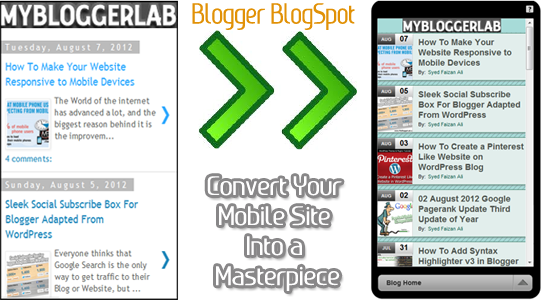
Before we get on with our tutorial let us look at our existing Mobile template for our Blogger Blog, in the subsequent screenshot, you can easily determine that the excellence is not up to the mark and the designing is not according to the expectation. Moreover, it looks dull and lacks the inspiration which is extremely crucial to engage mobile visitors. Blogger has 7 built in mobile templates but unluckily they are identical to each other, which make it quite useless.

How to Build a Customized Responsive Mobile Website on BlogSpot Blog: 

This whole tutorial is extremely straightforward, and would hardly take 20 minutes to design a perfect mobile responsive template for your BlogSpot blog. Moreover, you don’t need to learn HTML, CSS or JavaScript coding to design a Mobile-friendly template for your blog because we can handle each and everything with the help of a platform called GOMO an initiative of Google.

GoMo by Google Get Ready To GO MO:

GoMo and DudaMobile have come together to make your desktop blog more powerful and mobile-friendly. Do you know almost 70% mobile users abandon a mobile site only because of its designing and less responsiveness? Do you own a blog and want to create a friendly mobile responsive theme then you have come to the right place to get started.

Getting Started With your First Ever Mobile Responsive Template:


Step#1 Getting Started: 

First go to a website http://www.howtogomo.com now once it gets load scroll down and you will be able to see a picture which says “CREATE YOUR MOBILE SITE NOW” just select it and move to the next step.

Step#2 Claim your Website:

Then you have to enter your website/blog URL so system can easily detect the data which is currently hosted at your blog. After entering your complete URL along with http:// press the green button which says “MAKE MY SITE MOBILE”.

Step#3 Selecting the Type of your Site: 

Now the system will automatically detect whether you are running a website or a Blog, though you can change it anytime you like. Go ahead, and according to your interest select either Blog Templates, or Website templates (We personally think you should select Blog Templates because it gives you wide range of mobile responsive themes for your blog). 

Step#4 Choosing a Flawless Mobile Theme:

If you have chosen Blog Templates as your mobile theme category then you will witness an enormous list of themes, now you can select any theme that has the potentials to amuse your mobile readers. Additionally, with the help of interactive preview you can apply a theme and can examine how it will appear to your mobile users.  

To select a theme for your mobile-friendly website just double click on any template and it will be applied to your interactive live preview. The interactive preview allows you to test your mobile theme directly from your desktop. You can navigate through different pages and can test out each and every feature from top to bottom.

Now after testing out your theme on live preview it’s time to customize the color scheme of your mobile theme, so it looks identical to your Desktop version website Press next and move ahead. 

Step#5: Customizing and Stylizing Your Mobile-Friendly Theme:

Now you will be to witness an entire new interface from where you can customize your theme from header to footer without any hesitancy whatsoever. Just Press the “Full” tab present at the top and you will be able to see a list of thing which you can do with your mobile theme i.e. Edit Header & Logo, Edit Blog Homepage, Edit Blog Posts Style, Edit Blog Comment Style, Edit Footer and Much more.
 
  • Edit Header & Logo: When you will select “Header & Logo” tool a new widow will pop out from where you can customize your header or logo. You can either use Image Logo or can use Text based logo according to your needs.
  • Blog Homepage: If you want to change your background color or you want your customized background image then you can use this tool and can make your mobile theme more powerful in designing.
  • Blog Post: Using this tool you can change font size, background color, the color of your main post heading and much more.
  • Blog Comments: If you don’t have an interactive commenting system your visitors will never leave a comment so this tool will allow you to customize your comment style. You can change color, add avatar and much more.
  • Footer: As we all know Footer is the place where we give credits to the developer of the website so you can use it for that purpose. However, you can also use it to increase your width and height and much more.
Now After customizing your theme according to your needs go ahead and press Next button and you are almost done!

Step#6: Register Your Free Account:

Now enter your email address along with your password to register your Free account and Press Save My Site button to move to the next step.

Step#6: Redirecting Your OLD Mobile Site To New Mobile Friendly Site: 


Now you will be provided with the link where you can preview your mobile site with different mobile operating system i.e. Android, iPhone, Windows Mobile and Blackberry. Now Scroll down and you will see a button which says “SETUP MY MOBILE WEBSITE REDIRECT” just press it and move to the next step.
  • Now a new page will be opened now scroll down once again and you will see a chunk of JavaScript coding just Copy it with CTRL+C.
  • Then Go to Blogger.com >> Template >> Edit HTML >> Proceed
  • Now Search For <head> and just below it paste the code which you copied earlier and then save your Template.
That’s it your Customized mobile template is implemented to your Blogger BlogSpot blog. Now Go and enjoy playing with your mobile website on your Smartphones. 


- Reviewer: Unknown - ItemReviewed: HOW TO CREATE A CUSTOMIZED MOBILE FRIENDLY WEBSITE FOR BLOGGER BLOGSPOT

Tutorial Blog

Font

CorelDraw Tutorial

Photoshop Tutorial

Free Blogger Templates

Android

Logo

News Update

 
Rck - All right reserved
Roel Cipta Kreasindo | Personal Blogging Free Sharing Inform
© Blogmaker | Roel 2011 - 2012
Copyright © 2011 - 2012 roel cipta kreasindo sinjai - All rights reserved